• Steven Ponce
  • About
  • Data Visualizations
  • Projects
  • Resume
  • Email

On this page

  • Challenge
  • Visualization
  • Steps to Create this Graphic
    • 1. Load Packages & Setup
    • 2. Read in the Data
    • 3. Examine the Data
    • 4. Tidy Data
    • 5. Visualization Parameters
    • 6. Plot
    • 7. Save
    • 8. Session Info
    • 9. GitHub Repository
    • 10. References
    • 11. Custom Functions Documentation

The stage with the lowest odds isn’t FDA review

  • Show All Code
  • Hide All Code

  • View Source

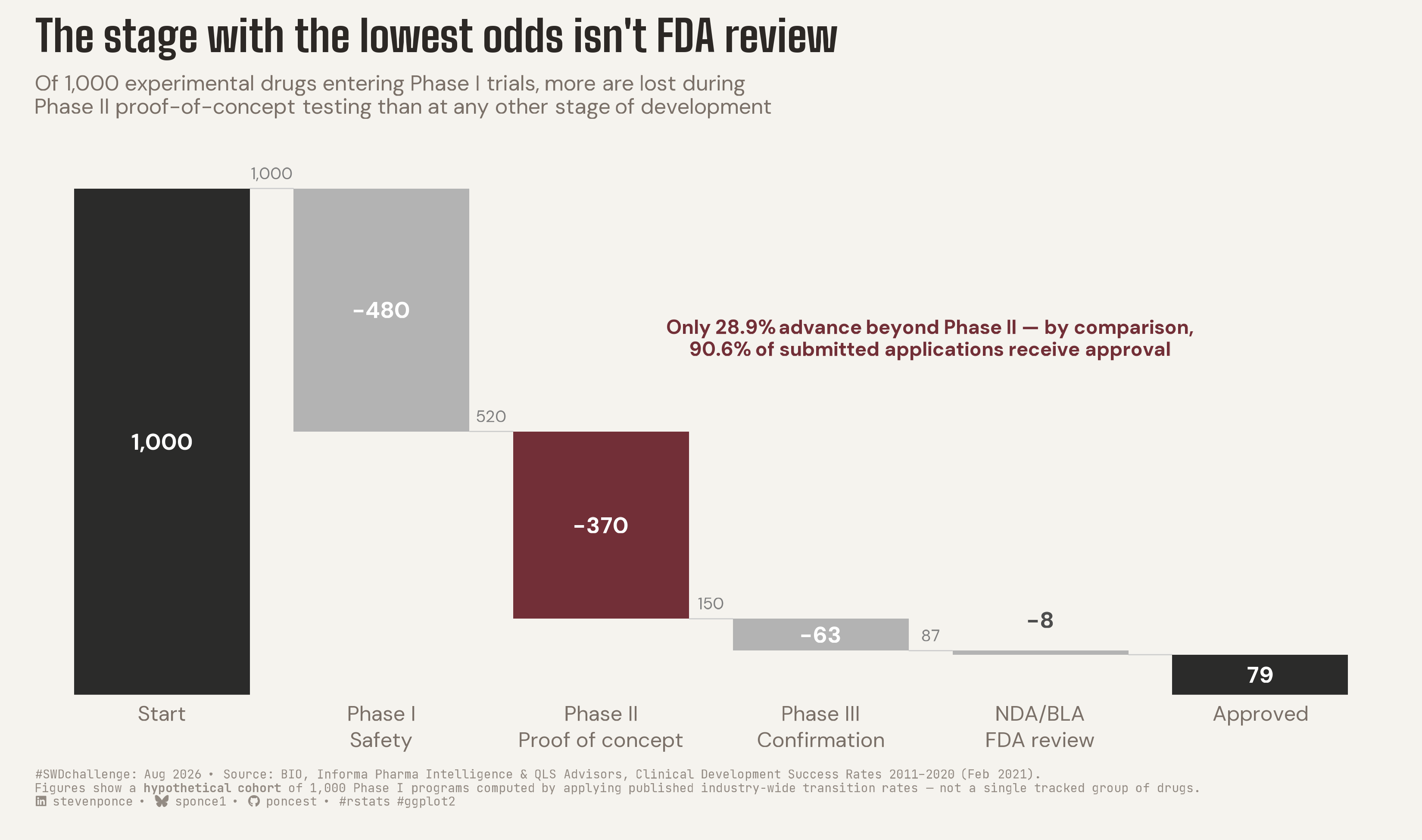
Of 1,000 experimental drugs entering Phase I trials, more are lost during Phase II proof-of-concept testing than at any other stage of development

SWDchallenge
Data Visualization
R Programming
2026
A waterfall chart applying published clinical-trial transition rates to 1,000 hypothetical Phase I drug candidates, showing that Phase II proof-of-concept testing — not FDA review — is where the most candidates are lost. Built in R with ggplot2, ggtext, and ggview, sourced from BIO, Informa Pharma Intelligence and QLS Advisors (2011–2020).
Author

Steven Ponce

Published

August 1, 2026

Challenge

Good stories often have a clear beginning, middle, and end. They don’t all have to look the same, however. This month’s challenge is to share a waterfall chart that sends a message.

Additional information can be found HERE

Visualization

Figure 1: Waterfall chart titled “The stage with the lowest odds isn’t FDA review.” The chart tracks a hypothetical cohort of 1,000 experimental drugs from Phase I trials through FDA approval, with floating bars showing how many candidates are lost at each development stage. Phase II proof-of-concept testing, highlighted in burgundy, eliminates more candidates than any other single stage — 370, compared to 480 in Phase I safety testing, 63 in Phase III confirmation, and just 8 during FDA review. Only 28.9% of candidates advance beyond Phase II, versus a 90.6% approval rate at FDA review. The bridge ends with 79 of the original 1,000 candidates reaching approval. Source: BIO, Informa Pharma Intelligence and QLS Advisors, Clinical Development Success Rates 2011–2020.

Steps to Create this Graphic

1. Load Packages & Setup

Show code
```{r}
#| label: load

if (!require("pacman")) install.packages("pacman")
pacman::p_load(
  tidyverse, ggtext, showtext, janitor, scales, glue, patchwork, ggview
  )

# Source utility functions
suppressMessages(source(here::here("R/utils/fonts.R")))
source(here::here("R/utils/social_icons.R"))
source(here::here("R/utils/image_utils.R"))
source(here::here("R/themes/base_theme.R"))
```

2. Read in the Data

Show code
```{r}
#| label: read

## No external file. Figures are sourced directly from the published report:
## BIO, Informa Pharma Intelligence & QLS Advisors. "Clinical Development
## Success Rates and Contributing Factors 2011-2020." February 2021.
## 12,728 phase transitions across 9,704 development programs, 2011-2020.
##
## Phase transition success rates ("all indications"):
##   Phase I   -> Phase II   : 52.0% (n = 4,414)
##   Phase II  -> Phase III  : 28.9% (n = 4,933)   
##   Phase III -> NDA/BLA    : 57.8% (n = 1,928)
##   NDA/BLA   -> Approval   : 90.6% (n = 1,453)  
##
## Overall likelihood of approval (LOA) from Phase I: 7.9% (n = 12,728)

phase_success_rates <- tribble(
  ~stage,        ~success_rate,
  "phase_1",     0.520,
  "phase_2",     0.289,
  "phase_3",     0.578,
  "nda_bla",     0.906
)
```

3. Examine the Data

Show code
```{r}
#| label: examine
#| include: true
#| eval: true
#| results: 'hide'
#| warning: false

glimpse(phase_success_rates)
```

4. Tidy Data

Show code
```{r}
#| label: tidy
#| output: false

## Apply the published rates to a hypothetical starting cohort of 1,000
## Phase I programs. This is a compounded-probability illustration, NOT a
## single tracked group of real drugs -- the "n" values above are
## transition-specific denominators from the full 2011-2020 dataset, not
## one cohort's headcount at each stage. Disclosed in the caption.

cohort_start <- 1000

cohort_totals <- phase_success_rates |>
  mutate(
    running_total = cohort_start * cumprod(success_rate),
    running_total = round(running_total)
  ) |>
  pull(running_total)

## Build the waterfall geometry
waterfall_data <- tibble(
  stage = c("Start", "Phase I", "Phase II", "Phase III", "NDA/BLA", "Approved"),
  bar_type = c("total", "loss", "loss", "loss", "loss", "total"),
  ymin = c(0, cohort_totals[1], cohort_totals[2], cohort_totals[3], cohort_totals[4], 0),
  ymax = c(1000, 1000, cohort_totals[1], cohort_totals[2], cohort_totals[3], cohort_totals[4])
) |>
  mutate(
    stage = fct_inorder(stage),
    x_pos = row_number(),
    bar_label = c(
      "1,000",
      glue("\u2212{comma(1000 - cohort_totals[1])}"),
      glue("\u2212{comma(cohort_totals[1] - cohort_totals[2])}"),
      glue("\u2212{comma(cohort_totals[2] - cohort_totals[3])}"),
      glue("\u2212{comma(cohort_totals[3] - cohort_totals[4])}"),
      comma(cohort_totals[4])
    ),
    is_accent = stage == "Phase II"
  )

## Connector segments
connector_data <- tibble(
  x    = waterfall_data$x_pos[1:5] + 0.4,
  xend = waterfall_data$x_pos[2:6] - 0.4,
  y    = c(1000, cohort_totals[1], cohort_totals[2], cohort_totals[3], cohort_totals[4]),
  yend = y
)

## Secondary running-total labels at each landing point.
running_total_labels <- tibble(
  x = c(1.5, 2.5, 3.5, 4.5),
  y = c(1000, cohort_totals[1], cohort_totals[2], cohort_totals[3]) + 30,
  label = comma(c(1000, cohort_totals[1], cohort_totals[2], cohort_totals[3]))
)

## Plain-language subtext under each phase name
stage_labels <- c(
  "Start"      = "Start",
  "Phase I"    = "Phase I\nSafety",
  "Phase II"   = "Phase II\nProof of concept",
  "Phase III"  = "Phase III\nConfirmation",
  "NDA/BLA"    = "NDA/BLA\nFDA review",
  "Approved"   = "Approved"
)[as.character(waterfall_data$stage)]
```

5. Visualization Parameters

Show code
```{r}
#| label: params

### |-  plot aesthetics ----
clrs <- get_theme_colors(
  palette = list(
    total  = "#2B2B2A",  
    loss   = "gray70",   
    accent = "#722F37"   
  )
)

### |-  titles and caption ----
title_text <- "The stage with the lowest odds isn't FDA review"

subtitle_text <- str_glue("Of 1,000 experimental drugs entering Phase I trials, more are lost during<br>","
                          Phase II proof-of-concept testing than at any other stage of development")

annotation_text <- "Only 28.9% advance beyond Phase II \u2014 by comparison,<br>90.6% of submitted applications receive approval"

caption_text <- create_swd_caption(
  year = 2026,
  month = "Aug",
  source_text = "BIO, Informa Pharma Intelligence & QLS Advisors, Clinical Development Success Rates 2011\u20132020 (Feb 2021).<br>Figures show a **hypothetical cohort** of 1,000 Phase I programs computed by applying published industry-wide transition rates \u2014 not a single tracked group of drugs."
)

### |-  fonts ----
setup_fonts()
fonts <- get_font_families()

### |-  plot theme ----
base_theme <- create_base_theme(clrs)

weekly_theme <- extend_weekly_theme(
  base_theme,
  theme(
    panel.grid.major.y = element_blank(),
    panel.grid.major.x = element_blank(),
    panel.grid.minor = element_blank(),
    axis.ticks = element_blank(),
    axis.text.y = element_blank(),
    axis.text.x = element_text(lineheight = 1.1),
    axis.title = element_blank(),
    plot.title.position = "plot",
    plot.title = element_text(
      face = "bold", size = rel(1.6), family = fonts$title_1,
      margin = margin(b = 8), fonts$title_1, color = clrs$title
    ),
    plot.subtitle = element_markdown(
      size = rel(0.8), family = fonts$subtitle, lineheight = 1.15,
      margin = margin(b = 16), color = clrs$subtitle
    ),
    plot.caption = element_textbox_simple(
      size = rel(0.45), family = fonts$caption, color = alpha(clrs$caption, 0.8),
      margin = margin(t = 10, b = 8)
    )
  )
)

theme_set(weekly_theme)
```

6. Plot

Show code
```{r}
#| label: plot
#| output: false

### |-  plot ----
p <- ggplot(waterfall_data) +
  geom_segment(
    data = connector_data,
    aes(x = x, xend = xend, y = y, yend = yend),
    color = "gray80", linewidth = 0.3
  ) +
  geom_rect(
    aes(
      xmin = x_pos - 0.4, xmax = x_pos + 0.4,
      ymin = ymin, ymax = ymax,
      fill = case_when(
        bar_type == "total" ~ "total",
        is_accent ~ "accent",
        TRUE ~ "loss"
      )
    ),
    color = NA
  ) +
  scale_fill_manual(
    values = c(total = clrs$palette$total, loss = clrs$palette$loss, accent = clrs$palette$accent),
    guide = "none"
  ) +
  geom_text(
    data = waterfall_data |> filter(stage != "NDA/BLA"),
    aes(x = x_pos, y = (ymin + ymax) / 2, label = bar_label),
    color = "white", fontface = "bold", size = 4.2, family = fonts$text
  ) +
  geom_text(
    data = waterfall_data |> filter(stage == "NDA/BLA"),
    aes(x = x_pos, y = ymax + 45, label = bar_label),
    color = "gray30", fontface = "bold", size = 4.2, family = fonts$text,
    vjust = 0
  ) +
  geom_text(
    data = running_total_labels,
    aes(x = x, y = y, label = label),
    color = "gray50", size = 3, family = fonts$text
  ) +
  annotate(
    "richtext",
    x = 4.5, y = 700,
    label = annotation_text,
    fill = NA, label.color = NA,
    color = clrs$palette$accent, size = 3.6, family = fonts$text, fontface = "bold",
    hjust = 0.5
  ) +
  scale_x_continuous(
    breaks = waterfall_data$x_pos,
    labels = stage_labels,
    expand = expansion(mult = 0.03)
  ) +
  scale_y_continuous(expand = expansion(mult = c(0, 0.05))) +
  labs(
    title = title_text,
    subtitle = subtitle_text,
    caption = caption_text,
    x = NULL,
    y = NULL
  ) +
  canvas(width = 11, height = 6.5, units = "in", dpi = 300)
```

7. Save

Show code
```{r}
#| label: save
#| warning: false

### |- save ----
main_path  <- here::here("data_visualizations", "SWD Challenge", "2026", "swd_2026_08.png")
thumb_path <- here::here("data_visualizations", "SWD Challenge", "2026", "thumbnails", "swd_2026_08.png")

# Full-size version, for the QMD figure
save_ggplot(
  plot = p,
  file = main_path,
  width = 11,
  height = 6.5,
  units = "in",
  dpi = 300,
  create.dir = TRUE
)

# Reduced-size thumbnail, for the YAML `image:` field
fs::dir_create(dirname(thumb_path))
magick::image_read(main_path) |>
  magick::image_resize("400") |>
  magick::image_write(thumb_path)
```

8. Session Info

TipExpand for Session Info
R version 4.6.1 (2026-06-24)
Platform: aarch64-apple-darwin23
Running under: macOS Tahoe 26.5.2

Matrix products: default
BLAS:   /Library/Frameworks/R.framework/Versions/4.6/Resources/lib/libRblas.0.dylib 
LAPACK: /Library/Frameworks/R.framework/Versions/4.6/Resources/lib/libRlapack.dylib;  LAPACK version 3.12.1

locale:
[1] en_US.UTF-8/en_US.UTF-8/en_US.UTF-8/C/en_US.UTF-8/en_US.UTF-8

time zone: America/New_York
tzcode source: internal

attached base packages:
[1] stats     graphics  grDevices utils     datasets  methods   base     

other attached packages:
 [1] here_1.0.2      ggview_0.2.2    patchwork_1.3.2 glue_1.8.1     
 [5] scales_1.4.0    janitor_2.2.1   showtext_0.9-8  showtextdb_3.0 
 [9] sysfonts_0.8.9  ggtext_0.1.2    lubridate_1.9.5 forcats_1.0.1  
[13] stringr_1.6.0   dplyr_1.2.1     purrr_1.2.2     readr_2.2.0    
[17] tidyr_1.3.2     tibble_3.3.1    ggplot2_4.0.3   tidyverse_2.0.0
[21] pacman_0.5.1   

loaded via a namespace (and not attached):
 [1] generics_0.1.4     xml2_1.6.0         stringi_1.8.7      hms_1.1.4         
 [5] digest_0.6.39      magrittr_2.0.5     evaluate_1.0.5     grid_4.6.1        
 [9] timechange_0.4.0   RColorBrewer_1.1-3 fastmap_1.2.0      rprojroot_2.1.1   
[13] jsonlite_2.0.0     textshaping_1.0.5  codetools_0.2-20   cli_3.6.6         
[17] rlang_1.3.0        litedown_0.10      commonmark_2.0.0   withr_3.0.3       
[21] yaml_2.3.12        otel_0.2.0         tools_4.6.1        tzdb_0.5.0        
[25] curl_7.1.0         vctrs_0.7.3        R6_2.6.1           magick_2.9.1      
[29] lifecycle_1.0.5    snakecase_0.11.1   fs_2.1.0           htmlwidgets_1.6.4 
[33] ragg_1.5.2         pkgconfig_2.0.3    pillar_1.11.1      gtable_0.3.6      
[37] Rcpp_1.1.2         systemfonts_1.3.2  xfun_0.60          tidyselect_1.2.1  
[41] rstudioapi_0.19.0  knitr_1.51         farver_2.1.2       htmltools_0.5.9   
[45] labeling_0.4.3     rmarkdown_2.31     compiler_4.6.1     S7_0.2.2          
[49] markdown_2.0       gridtext_0.1.6    

9. GitHub Repository

TipExpand for GitHub Repo

The complete code for this analysis is available in swd_2026_08.qmd. For the full repository, click here.

10. References

TipExpand for References

SWD Challenge: - Storytelling with Data: August 2026 — whip up a waterfall (URL inferred from July’s slug pattern — not verified; the community site is JS-rendered and I couldn’t confirm the exact slug. Worth a manual check before publishing.)

Data Sources: - BIO, Informa Pharma Intelligence & QLS Advisors. Clinical Development Success Rates and Contributing Factors 2011–2020. February 2021. https://www.bio.org/clinical-development-success-rates-and-contributing-factors-2011-2020 — phase-transition success rates: Phase I→II 52.0%, Phase II→III 28.9%, Phase III→NDA/BLA 57.8%, NDA/BLA→Approval 90.6% (12,728 transitions, 9,704 programs, 2011–2020).

Methodology Note: - Figures represent a hypothetical cohort of 1,000 Phase I programs, computed by applying the report’s published transition rates as compounded probabilities — not a single tracked group of real drugs. The underlying “n” values in the source report are transition-specific denominators from the full 2011–2020 dataset, not one cohort’s headcount at each stage. Disclosed in the chart caption.

11. Custom Functions Documentation

Note📦 Custom Helper Functions

This analysis uses custom functions from my personal module library for efficiency and consistency across projects.

Functions Used:

  • fonts.R: setup_fonts(), get_font_families() - Font management with showtext
  • social_icons.R: create_social_caption() - Generates formatted social media captions
  • image_utils.R: save_plot() - Consistent plot saving with naming conventions
  • base_theme.R: create_base_theme(), extend_weekly_theme(), get_theme_colors() - Custom ggplot2 themes

Why custom functions?
These utilities standardize theming, fonts, and output across all my data visualizations. The core analysis (data tidying and visualization logic) uses only standard tidyverse packages.

Source Code:
View all custom functions → GitHub: R/utils

Back to top

Citation

BibTeX citation:
@online{ponce2026,
  author = {Ponce, Steven},
  title = {The Stage with the Lowest Odds Isn’t {FDA} Review},
  date = {2026-08-01},
  url = {https://stevenponce.netlify.app/data_visualizations/SWD%20Challenge/2026/swd_2026_08.html},
  langid = {en}
}
For attribution, please cite this work as:
Ponce, Steven. 2026. “The Stage with the Lowest Odds Isn’t FDA Review.” August 1. https://stevenponce.netlify.app/data_visualizations/SWD%20Challenge/2026/swd_2026_08.html.
Source Code
---
title: "The stage with the lowest odds isn't FDA review"
subtitle: "Of 1,000 experimental drugs entering Phase I trials, more are lost during Phase II proof-of-concept testing than at any other stage of development"
description: "A waterfall chart applying published clinical-trial transition rates to 1,000 hypothetical Phase I drug candidates, showing that Phase II proof-of-concept testing — not FDA review — is where the most candidates are lost. Built in R with ggplot2, ggtext, and ggview, sourced from BIO, Informa Pharma Intelligence and QLS Advisors (2011–2020)."
date: "2026-08-01"
author:
  - name: "Steven Ponce"
    url: "https://stevenponce.netlify.app"
citation:
  url: "https://stevenponce.netlify.app/data_visualizations/SWD%20Challenge/2026/swd_2026_08.html"
categories: ["SWDchallenge", "Data Visualization", "R Programming", "2026"]
tags: [
  "SWDchallenge",
  "waterfall-chart",
  "drug-development",
  "clinical-trials",
  "pharma",
  "attrition",
  "ggplot2",
  "ggtext",
  "ggview",
  "r-programming",
  "annotation",
  "storytelling-with-data",
  "2026"
]
image: "thumbnails/swd_2026_08.png"
format:
  html:
    toc: true
    toc-depth: 5
    code-link: true
    code-fold: true
    code-tools: true
    code-summary: "Show code"
    self-contained: true
    theme: 
      light: [flatly, assets/styling/custom_styles.scss]
      dark: [darkly, assets/styling/custom_styles_dark.scss]
editor_options: 
  chunk_output_type: inline
execute: 
  freeze: true
  cache: true
  error: false
  message: false
  warning: false
  eval: true
---

### Challenge

Good stories often have a clear beginning, middle, and end. They don’t all have to look the same, however. This month’s challenge is to share a waterfall chart that sends a message.

Additional information can be found [HERE](https://community.storytellingwithdata.com/challenges)

### Visualization
![Waterfall chart titled "The stage with the lowest odds isn't FDA review." The chart tracks a hypothetical cohort of 1,000 experimental drugs from Phase I trials through FDA approval, with floating bars showing how many candidates are lost at each development stage. Phase II proof-of-concept testing, highlighted in burgundy, eliminates more candidates than any other single stage — 370, compared to 480 in Phase I safety testing, 63 in Phase III confirmation, and just 8 during FDA review. Only 28.9% of candidates advance beyond Phase II, versus a 90.6% approval rate at FDA review. The bridge ends with 79 of the original 1,000 candidates reaching approval. Source: BIO, Informa Pharma Intelligence and QLS Advisors, Clinical Development Success Rates 2011–2020.](swd_2026_08.png){#fig-1}

### [**Steps to Create this Graphic**]{.mark}

#### [1. Load Packages & Setup]{.smallcaps}

```{r}
#| label: load

if (!require("pacman")) install.packages("pacman")
pacman::p_load(
  tidyverse, ggtext, showtext, janitor, scales, glue, patchwork, ggview
  )

# Source utility functions
suppressMessages(source(here::here("R/utils/fonts.R")))
source(here::here("R/utils/social_icons.R"))
source(here::here("R/utils/image_utils.R"))
source(here::here("R/themes/base_theme.R"))
```

#### [2. Read in the Data]{.smallcaps}

```{r}
#| label: read

## No external file. Figures are sourced directly from the published report:
## BIO, Informa Pharma Intelligence & QLS Advisors. "Clinical Development
## Success Rates and Contributing Factors 2011-2020." February 2021.
## 12,728 phase transitions across 9,704 development programs, 2011-2020.
##
## Phase transition success rates ("all indications"):
##   Phase I   -> Phase II   : 52.0% (n = 4,414)
##   Phase II  -> Phase III  : 28.9% (n = 4,933)   
##   Phase III -> NDA/BLA    : 57.8% (n = 1,928)
##   NDA/BLA   -> Approval   : 90.6% (n = 1,453)  
##
## Overall likelihood of approval (LOA) from Phase I: 7.9% (n = 12,728)

phase_success_rates <- tribble(
  ~stage,        ~success_rate,
  "phase_1",     0.520,
  "phase_2",     0.289,
  "phase_3",     0.578,
  "nda_bla",     0.906
)
```

#### [3. Examine the Data]{.smallcaps}

```{r}
#| label: examine
#| include: true
#| eval: true
#| results: 'hide'
#| warning: false

glimpse(phase_success_rates)
```

#### [4. Tidy Data]{.smallcaps}

```{r}
#| label: tidy
#| output: false

## Apply the published rates to a hypothetical starting cohort of 1,000
## Phase I programs. This is a compounded-probability illustration, NOT a
## single tracked group of real drugs -- the "n" values above are
## transition-specific denominators from the full 2011-2020 dataset, not
## one cohort's headcount at each stage. Disclosed in the caption.

cohort_start <- 1000

cohort_totals <- phase_success_rates |>
  mutate(
    running_total = cohort_start * cumprod(success_rate),
    running_total = round(running_total)
  ) |>
  pull(running_total)

## Build the waterfall geometry
waterfall_data <- tibble(
  stage = c("Start", "Phase I", "Phase II", "Phase III", "NDA/BLA", "Approved"),
  bar_type = c("total", "loss", "loss", "loss", "loss", "total"),
  ymin = c(0, cohort_totals[1], cohort_totals[2], cohort_totals[3], cohort_totals[4], 0),
  ymax = c(1000, 1000, cohort_totals[1], cohort_totals[2], cohort_totals[3], cohort_totals[4])
) |>
  mutate(
    stage = fct_inorder(stage),
    x_pos = row_number(),
    bar_label = c(
      "1,000",
      glue("\u2212{comma(1000 - cohort_totals[1])}"),
      glue("\u2212{comma(cohort_totals[1] - cohort_totals[2])}"),
      glue("\u2212{comma(cohort_totals[2] - cohort_totals[3])}"),
      glue("\u2212{comma(cohort_totals[3] - cohort_totals[4])}"),
      comma(cohort_totals[4])
    ),
    is_accent = stage == "Phase II"
  )

## Connector segments
connector_data <- tibble(
  x    = waterfall_data$x_pos[1:5] + 0.4,
  xend = waterfall_data$x_pos[2:6] - 0.4,
  y    = c(1000, cohort_totals[1], cohort_totals[2], cohort_totals[3], cohort_totals[4]),
  yend = y
)

## Secondary running-total labels at each landing point.
running_total_labels <- tibble(
  x = c(1.5, 2.5, 3.5, 4.5),
  y = c(1000, cohort_totals[1], cohort_totals[2], cohort_totals[3]) + 30,
  label = comma(c(1000, cohort_totals[1], cohort_totals[2], cohort_totals[3]))
)

## Plain-language subtext under each phase name
stage_labels <- c(
  "Start"      = "Start",
  "Phase I"    = "Phase I\nSafety",
  "Phase II"   = "Phase II\nProof of concept",
  "Phase III"  = "Phase III\nConfirmation",
  "NDA/BLA"    = "NDA/BLA\nFDA review",
  "Approved"   = "Approved"
)[as.character(waterfall_data$stage)]
```

#### [5. Visualization Parameters]{.smallcaps}

```{r}
#| label: params

### |-  plot aesthetics ----
clrs <- get_theme_colors(
  palette = list(
    total  = "#2B2B2A",  
    loss   = "gray70",   
    accent = "#722F37"   
  )
)

### |-  titles and caption ----
title_text <- "The stage with the lowest odds isn't FDA review"

subtitle_text <- str_glue("Of 1,000 experimental drugs entering Phase I trials, more are lost during<br>","
                          Phase II proof-of-concept testing than at any other stage of development")

annotation_text <- "Only 28.9% advance beyond Phase II \u2014 by comparison,<br>90.6% of submitted applications receive approval"

caption_text <- create_swd_caption(
  year = 2026,
  month = "Aug",
  source_text = "BIO, Informa Pharma Intelligence & QLS Advisors, Clinical Development Success Rates 2011\u20132020 (Feb 2021).<br>Figures show a **hypothetical cohort** of 1,000 Phase I programs computed by applying published industry-wide transition rates \u2014 not a single tracked group of drugs."
)

### |-  fonts ----
setup_fonts()
fonts <- get_font_families()

### |-  plot theme ----
base_theme <- create_base_theme(clrs)

weekly_theme <- extend_weekly_theme(
  base_theme,
  theme(
    panel.grid.major.y = element_blank(),
    panel.grid.major.x = element_blank(),
    panel.grid.minor = element_blank(),
    axis.ticks = element_blank(),
    axis.text.y = element_blank(),
    axis.text.x = element_text(lineheight = 1.1),
    axis.title = element_blank(),
    plot.title.position = "plot",
    plot.title = element_text(
      face = "bold", size = rel(1.6), family = fonts$title_1,
      margin = margin(b = 8), fonts$title_1, color = clrs$title
    ),
    plot.subtitle = element_markdown(
      size = rel(0.8), family = fonts$subtitle, lineheight = 1.15,
      margin = margin(b = 16), color = clrs$subtitle
    ),
    plot.caption = element_textbox_simple(
      size = rel(0.45), family = fonts$caption, color = alpha(clrs$caption, 0.8),
      margin = margin(t = 10, b = 8)
    )
  )
)

theme_set(weekly_theme)

```

#### [6. Plot]{.smallcaps}

```{r}
#| label: plot
#| output: false

### |-  plot ----
p <- ggplot(waterfall_data) +
  geom_segment(
    data = connector_data,
    aes(x = x, xend = xend, y = y, yend = yend),
    color = "gray80", linewidth = 0.3
  ) +
  geom_rect(
    aes(
      xmin = x_pos - 0.4, xmax = x_pos + 0.4,
      ymin = ymin, ymax = ymax,
      fill = case_when(
        bar_type == "total" ~ "total",
        is_accent ~ "accent",
        TRUE ~ "loss"
      )
    ),
    color = NA
  ) +
  scale_fill_manual(
    values = c(total = clrs$palette$total, loss = clrs$palette$loss, accent = clrs$palette$accent),
    guide = "none"
  ) +
  geom_text(
    data = waterfall_data |> filter(stage != "NDA/BLA"),
    aes(x = x_pos, y = (ymin + ymax) / 2, label = bar_label),
    color = "white", fontface = "bold", size = 4.2, family = fonts$text
  ) +
  geom_text(
    data = waterfall_data |> filter(stage == "NDA/BLA"),
    aes(x = x_pos, y = ymax + 45, label = bar_label),
    color = "gray30", fontface = "bold", size = 4.2, family = fonts$text,
    vjust = 0
  ) +
  geom_text(
    data = running_total_labels,
    aes(x = x, y = y, label = label),
    color = "gray50", size = 3, family = fonts$text
  ) +
  annotate(
    "richtext",
    x = 4.5, y = 700,
    label = annotation_text,
    fill = NA, label.color = NA,
    color = clrs$palette$accent, size = 3.6, family = fonts$text, fontface = "bold",
    hjust = 0.5
  ) +
  scale_x_continuous(
    breaks = waterfall_data$x_pos,
    labels = stage_labels,
    expand = expansion(mult = 0.03)
  ) +
  scale_y_continuous(expand = expansion(mult = c(0, 0.05))) +
  labs(
    title = title_text,
    subtitle = subtitle_text,
    caption = caption_text,
    x = NULL,
    y = NULL
  ) +
  canvas(width = 11, height = 6.5, units = "in", dpi = 300)
```

#### [7. Save]{.smallcaps}

```{r}
#| label: save
#| warning: false

### |- save ----
main_path  <- here::here("data_visualizations", "SWD Challenge", "2026", "swd_2026_08.png")
thumb_path <- here::here("data_visualizations", "SWD Challenge", "2026", "thumbnails", "swd_2026_08.png")

# Full-size version, for the QMD figure
save_ggplot(
  plot = p,
  file = main_path,
  width = 11,
  height = 6.5,
  units = "in",
  dpi = 300,
  create.dir = TRUE
)

# Reduced-size thumbnail, for the YAML `image:` field
fs::dir_create(dirname(thumb_path))
magick::image_read(main_path) |>
  magick::image_resize("400") |>
  magick::image_write(thumb_path)
```


#### [8. Session Info]{.smallcaps}

::: {.callout-tip collapse="true"}
##### Expand for Session Info

```{r, echo = FALSE}
#| eval: true
#| warning: false

sessionInfo()
```
:::

#### [9. GitHub Repository]{.smallcaps}

::: {.callout-tip collapse="true"}
##### Expand for GitHub Repo

The complete code for this analysis is available in [`swd_2026_08.qmd`](https://github.com/poncest/personal-website/tree/master/data_visualizations/SWD%20Challenge/2026/swd_2026_08.qmd). For the full repository, [click here](https://github.com/poncest/personal-website/).
:::

#### [10. References]{.smallcaps}

::: {.callout-tip collapse="true"}
##### Expand for References

**SWD Challenge:**
- Storytelling with Data: [August 2026 — whip up a waterfall](https://community.storytellingwithdata.com/challenges/aug-2026-whip-up-a-waterfall) *(URL inferred from July's slug pattern — not verified; the community site is JS-rendered and I couldn't confirm the exact slug. Worth a manual check before publishing.)*

**Data Sources:**
- BIO, Informa Pharma Intelligence & QLS Advisors. *Clinical Development Success Rates and Contributing Factors 2011–2020*. February 2021. <https://www.bio.org/clinical-development-success-rates-and-contributing-factors-2011-2020> — phase-transition success rates: Phase I→II 52.0%, Phase II→III 28.9%, Phase III→NDA/BLA 57.8%, NDA/BLA→Approval 90.6% (12,728 transitions, 9,704 programs, 2011–2020).

**Methodology Note:**
- Figures represent a hypothetical cohort of 1,000 Phase I programs, computed by applying the report's published transition rates as compounded probabilities — not a single tracked group of real drugs. The underlying "n" values in the source report are transition-specific denominators from the full 2011–2020 dataset, not one cohort's headcount at each stage. Disclosed in the chart caption.
:::


#### [11. Custom Functions Documentation]{.smallcaps}

::: {.callout-note collapse="true"}
##### 📦 Custom Helper Functions

This analysis uses custom functions from my personal module library for efficiency and consistency across projects.

**Functions Used:**

-   **`fonts.R`**: `setup_fonts()`, `get_font_families()` - Font management with showtext
-   **`social_icons.R`**: `create_social_caption()` - Generates formatted social media captions
-   **`image_utils.R`**: `save_plot()` - Consistent plot saving with naming conventions
-   **`base_theme.R`**: `create_base_theme()`, `extend_weekly_theme()`, `get_theme_colors()` - Custom ggplot2 themes

**Why custom functions?**\
These utilities standardize theming, fonts, and output across all my data visualizations. The core analysis (data tidying and visualization logic) uses only standard tidyverse packages.

**Source Code:**\
View all custom functions → [GitHub: R/utils](https://github.com/poncest/personal-website/tree/master/R)
:::

© 2024 Steven Ponce

Source Issues